To layer patterns without making a room feel busy, choose one dominant print, add a smaller coordinating pattern, bring in a stripe or geometric, and keep at least one major surface quiet. Repeat two or three colors across the room, vary the scale of each pattern, and spread the strongest prints around the space instead of clustering them in one spot.
A layered room should feel connected, not perfectly matched. The most inviting combinations often include patterns from different families, but each one has a distinct job. One establishes the palette, another adds structure, and a smaller accent brings personality.
START WITH SCALE
Make every pattern readable.
Pattern scale matters more than whether every print belongs to the same collection. Two medium florals can blur together and compete. A large botanical, a narrow stripe, and a tiny check remain distinct, even when they share several colors.
LARGE
The pattern that leads
Use it on wallpaper, curtains, a rug, or one upholstered chair. It should be the first pattern you notice.
MEDIUM
The pattern that connects
A plaid, block print, or smaller floral can bridge the hero pattern to the rest of the room.
SMALL
The pattern that finishes
Ticking, gingham, or a tiny motif adds detail without becoming another focal point.
BUILD THE PALETTE
Repeat colors, not exact prints.
Choose two main colors and one smaller accent from the hero pattern. Let those colors reappear at different strengths across the room. The repetition creates harmony while the changing motifs keep the room from feeling like a matching set.
- 60 percent foundation: walls, sofa, bedding, or another quieter surface
- 30 percent supporting color: curtains, chairs, or a rug
- 10 percent accent: pillows, trim, lampshades, or artwork
DISTRIBUTE THE PATTERN
Balance the room from side to side.
A room can feel overwhelming when every strong pattern is concentrated on one wall or one piece of furniture. Place the dominant prints in different parts of the room, then use smaller repeats to move the eye between them.
Separate the boldest prints
If the curtains are a large floral, let the rug carry a quieter pattern and place the second bold print across the room.
Use stripes as a neutral
Stripes pair easily with florals, checks, plaids, and geometrics because their orderly lines give the eye structure.
Repeat each strong color
Echo an accent at least twice, such as red in a rug and pillow or green in curtains and a lampshade.
SEE THE FORMULA AT WORK
Four rooms, four different pattern stories.
The formula works across color palettes and room types. What changes is which pattern leads and where the visual quiet comes from.
01
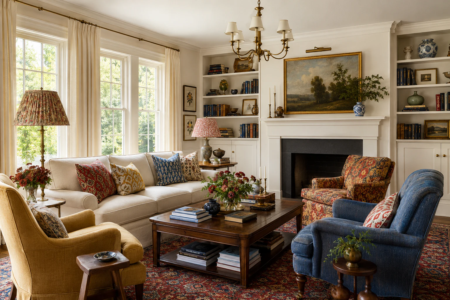
COLORFUL LIVING ROOM
Let a multicolor rug connect the room.
The rug introduces red, blue, green, and gold. Florals and stripes repeat those colors at different scales, while warm wood and light walls keep the palette grounded.
See the complete living room collection →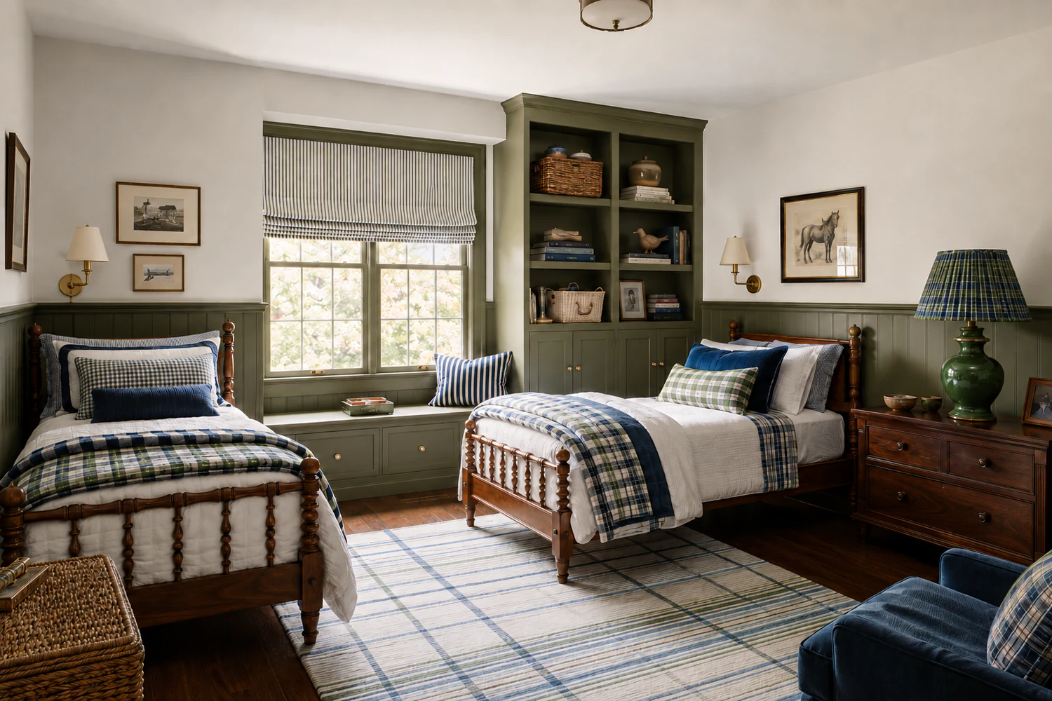
02
BOYS’ BEDROOM
Use plaid and stripes for tailored structure.
A restricted blue and green palette allows several patterns to coexist. Plaid carries the most visual weight, while narrow stripes and solids make the room feel polished rather than themed.
Explore Blue & Green Boys’ Rooms →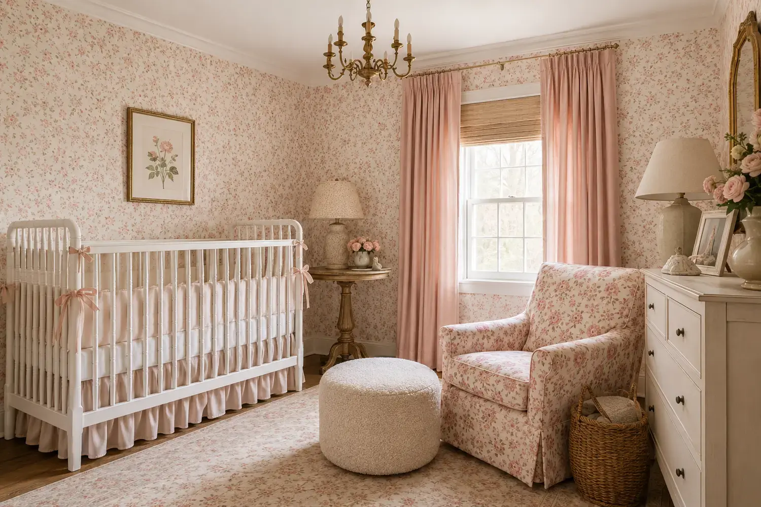
03
PINK NURSERY
Pair an all-over floral with quiet upholstery.
The wallpaper is the clear hero. A faded rug adds a second layer without matching it exactly, while cream upholstery, white furniture, and natural texture give the patterns room to breathe.
See Traditional Pink Nursery Ideas →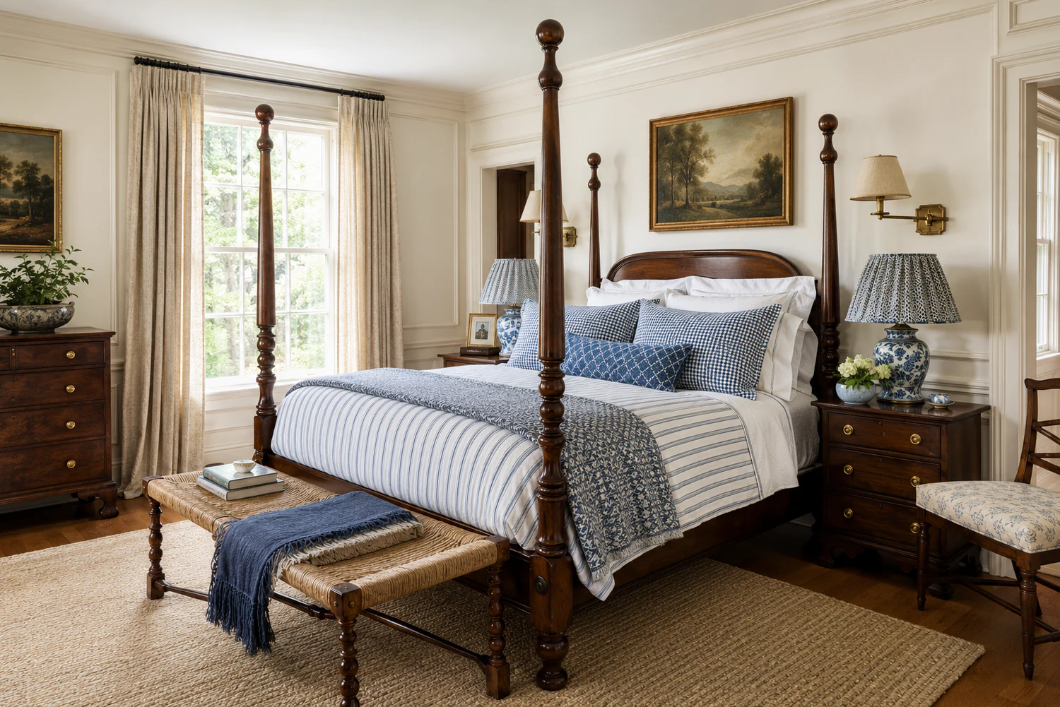
04
TRADITIONAL BEDROOM
Repeat one color through several pattern families.
Blue appears in florals, stripes, and the rug, but each pattern has a different scale and shape. White bedding and warm wood stop the repeated color from feeling overly coordinated.
Explore Traditional Bedrooms →COMMON MISTAKES
What makes a layered room feel too busy?
- Using several patterns at the same scale. Give each print a different visual size so the eye can separate them.
- Making every pattern equally bold. One print should lead while the others support it.
- Clustering all the pattern in one area. Spread stronger prints around the room for visual balance.
- Adding new colors with every pattern. Build from a limited palette and repeat colors instead.
- Forgetting solids and texture. Warm wood, linen, velvet, jute, and solid upholstery create necessary pauses.
- Buying everything at once. Order samples, place them together in the room, and add layers one at a time.
SHOP THE BUILDING BLOCKS
Patterned pieces for a collected room.
A varied edit of florals, checks, drapery, and rugs from several sources. Use these as individual layers rather than a prescribed matching set.

Dominant floral
Brio Fabric in Pink
Sister Parish Design
Shop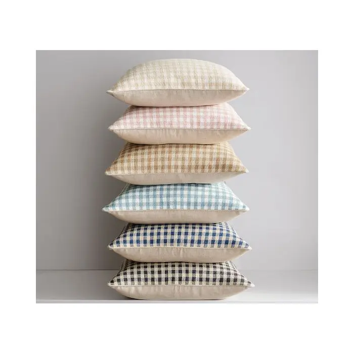
Small-scale check
Blaine Check Pillow
Pottery Barn
Shop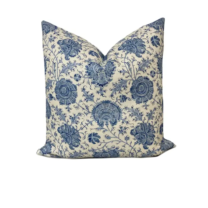
Accent floral
Lee Jofa Indiennes Floral Delft Pillow
Etsy
Shop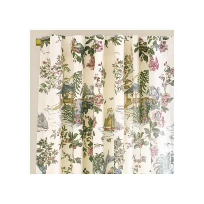
Large-scale print
Lille Chinoiserie Drapery Panel
Ballard Designs
Shop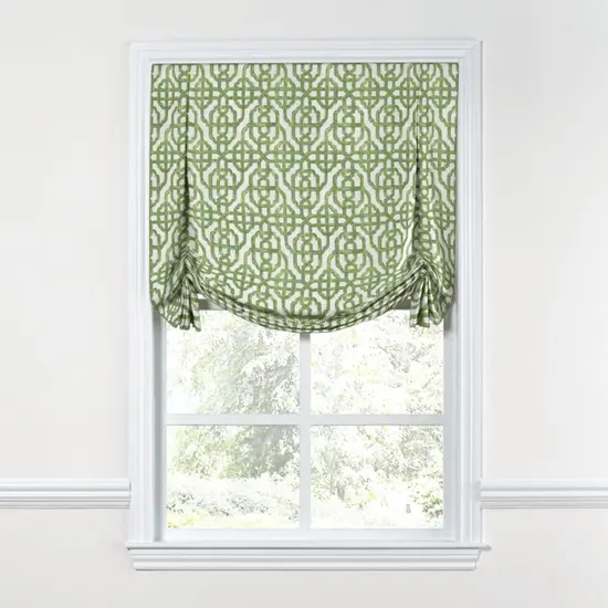
Geometric layer
Millie Moss Woven Roman Shade
Pepper Home
Shop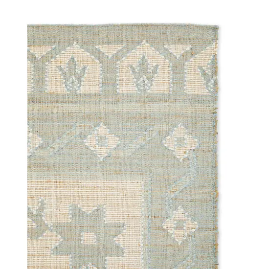
Traditional anchor
Ralph Lauren Richmond Rug
Rugs Direct
ShopFREQUENTLY ASKED QUESTIONS
Pattern layering questions, answered.
How many patterns can you use in one room?
Three patterns are an easy starting point: one dominant print, one smaller coordinating pattern, and one stripe or geometric. A room can hold more when the palette is controlled and some major surfaces remain solid or quietly textured.
Do patterns have to share the exact same colors?
No. They need a clear relationship, not a perfect match. Repeating one or two colors across the patterns is usually enough, especially when the undertones and overall mood feel compatible.
Can you mix floral, plaid, and stripes?
Yes. Florals provide movement, plaid adds structure, and stripes act almost like a neutral. Keep their scales noticeably different and repeat at least one color across the group.
How do you mix patterns in a small room?
Use a tighter palette and vary the amount of each pattern. Let one print cover the largest area, use a second on a smaller piece, and reserve the boldest accent for a pillow, lampshade, or ottoman.
What should stay solid in a patterned room?
At least one major element should usually be solid or low contrast. A sofa, bedding, wall color, or rug can provide the visual pause that makes the patterned pieces feel intentional.